Im Ben Thatcher, im 21 years old and have a passion for graphic design and photography. In my work I love to try and keep everything as clean an minimal as possible (there are ovisouly certain cases where this cant be done). I have a passion for motorsport, aircraft and photography and aim to make one of these if not all of them the main focus of my career.
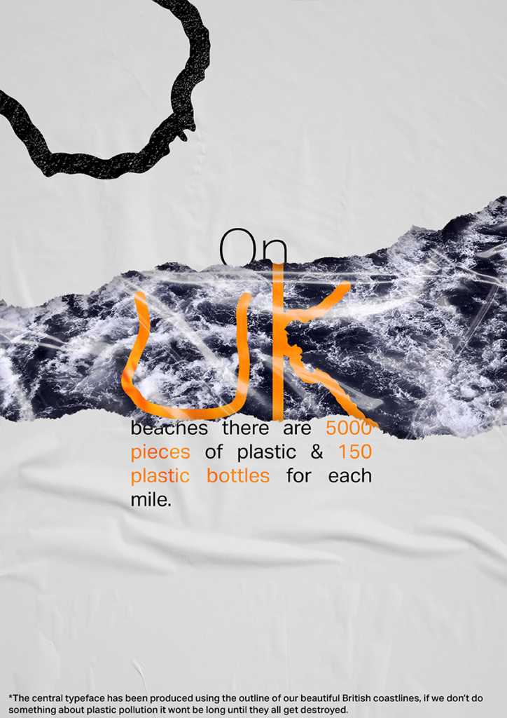
Coastline Sans
Final Major Project Campaign Design
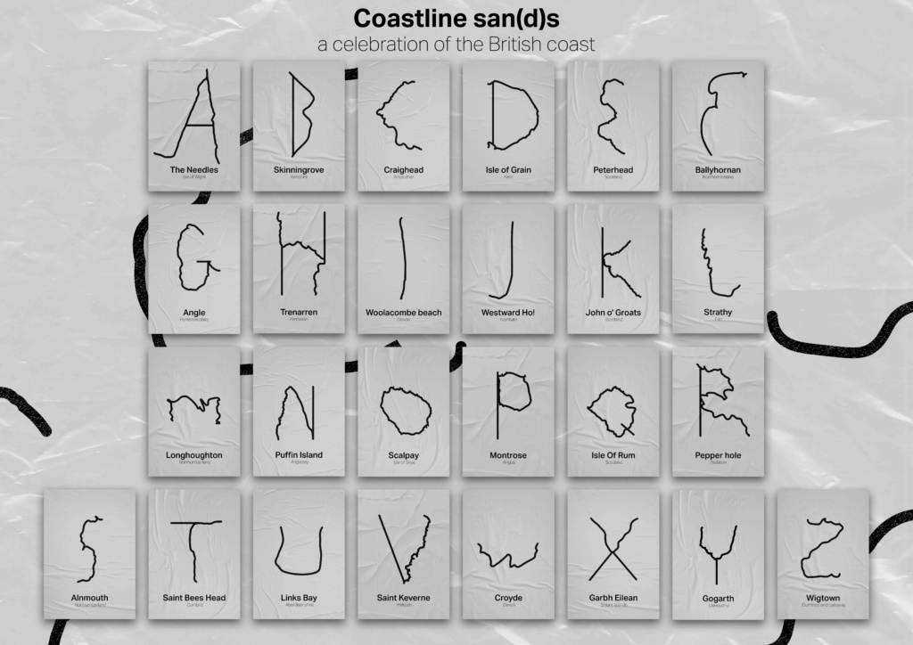
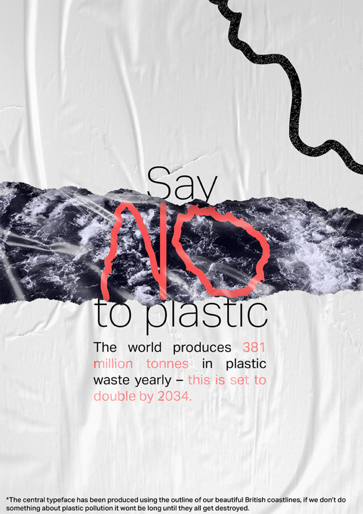
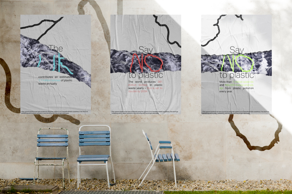
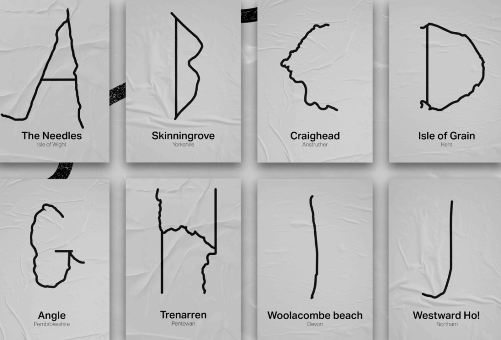
This project is all about celebrating our coastlines as well as raising awareness of the damage plastic pollution is having on our coast. Our coast is something that deserves to be both celebrated and protected and currently it is being destroyed by all the plastic we are throwing into out ocean. To celebrate our coast and its beauty I have created a type face using various coastlines from around the UK and to help raise awareness of plastic pollution I have created a series of posters to help make people aware of the problems that plastic pollution can cause whilst staying away for the typical design of current posters about plastic pollution.
The audience for this project is really anyone of any gender, obviously the younger audience may not be able to have as much of an impact with their action as they may live at home with parents however will still be able to make their parents aware and inform them with the information they get from the posters to hopefully make them realise they need to cut back on their plastic use.
Our coast is something that deserves to be both celebrated and protected...
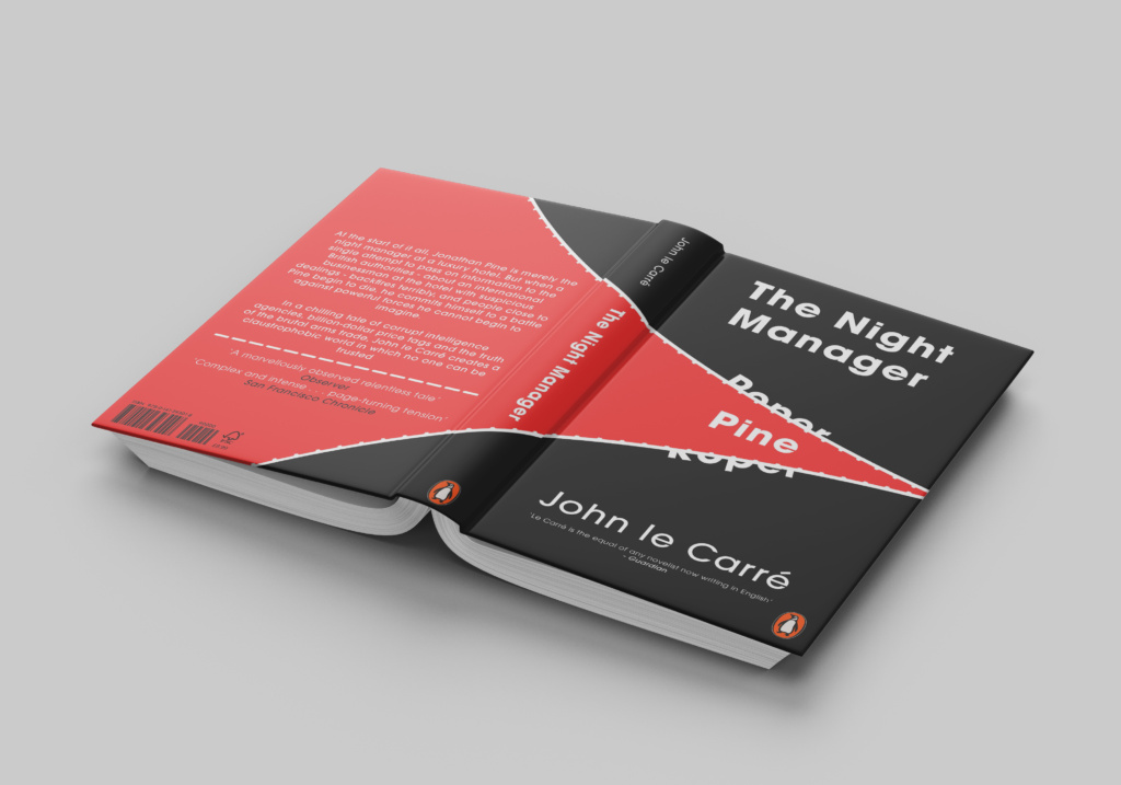
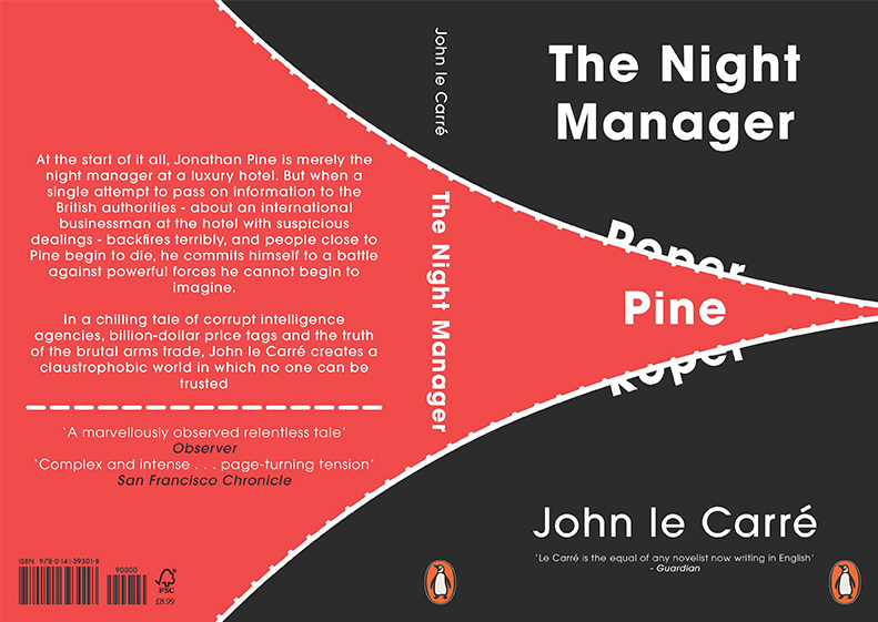
The cover has been made to look like the black (roper) is almost being torn apart thus revealing the red (pine).
'The Night Manager' Cover
Competitions Penguin Book Cover
This is a book cover that I created for the book ‘The Night Manager’ by John le Carré, it’s a very simplistic cover and very flat however it perfectly gives the viewer and essence of the book without giving them too much information which would in turn ruin the book for them.
I decided to go for a minimal design as this is one of my preferred styles. I believe it really captures the essence of the book without giving to much away, obviously if you’re familiar with the story then its much more obvious but to those unaware I believe it’s the perfect balance. The cover has been made to look like the black (roper) is almost being torn apart thus revealing the red (pine).