I am Amy, a proud Welsh speaking designer, from North Wales. During my final year at university I have found a passion for typography, whilst working on my final major project in which I designed a typeface, and my ISTD submission. I enjoy all areas of graphic design and I am always excited to try new things and adapt my skills for new challenges.
My dissertation findings have encouraged me to be aware of my responsibility as a designer, and I believe that design shouldn’t just look good, it should do good.
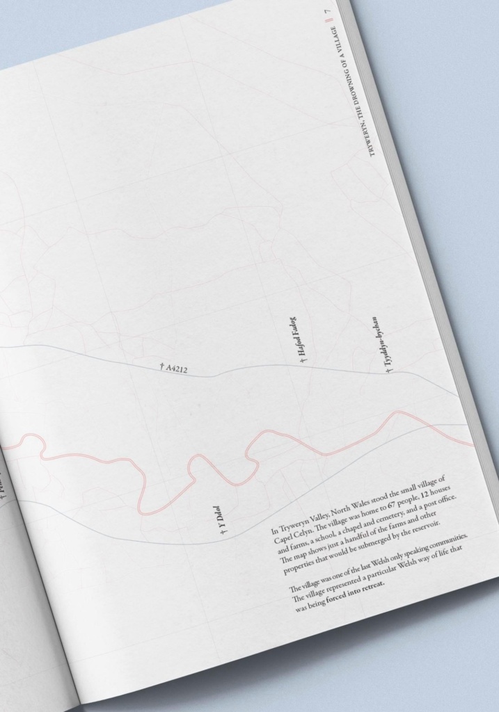
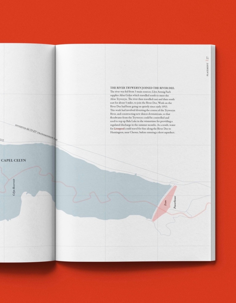
The Drowning of a Village
ISTD Entry Editorial Design
A typographic book, designed for the ISTD 2020 student assessment, migration brief. The narrative of the book focuses on the events that happened in Capel Celyn. Involuntary migration occurs when people are forced to leave their home or homeland. In the 1960’s, the small community of Capel Celyn, North Wales, was displaced and forced to migrate from their village when Liverpool obtained authority of Tryweryn Valley, where Capel Celyn was located, as a new source of water. Typographically, the context of the publication has been celebrated through the typographic design decisions.
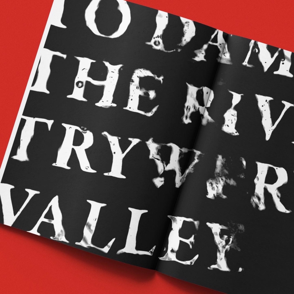
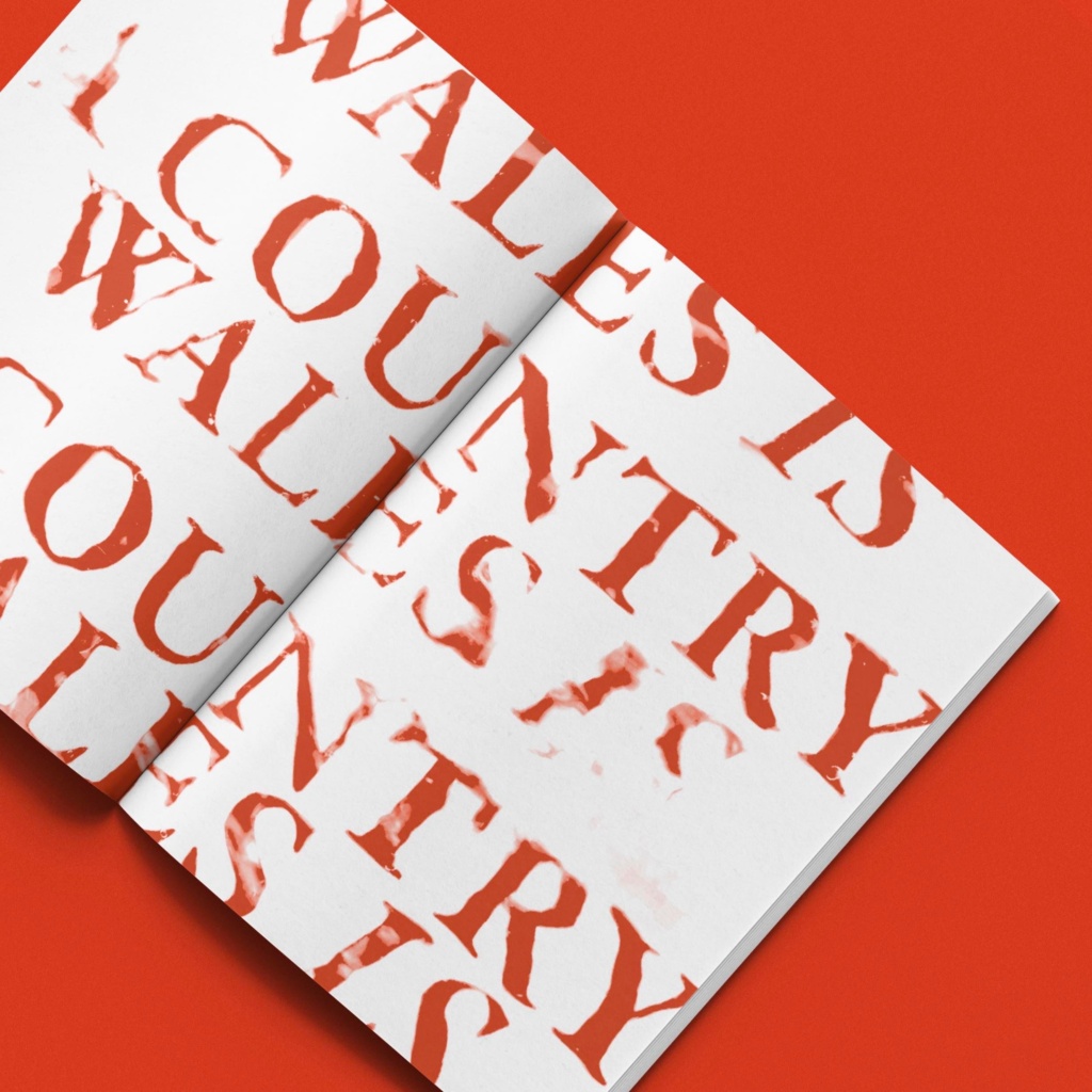
The delicate and traditional Garmond Premier Pro typeface is fitting as it pertains to the official governmental documents of the time. This sense of nostalgia is also reflected in the detailed map illustrations, which create a sense of place. The evocative typographic experiments, which has been submerged in water and photographed, aim to create a sense of drowning, reflecting what it might have felt like both on a literal and metaphorical level for the village, and indeed its inhabitants at the time. The colour red is essentially the national colour of Wales, making it as relevant as the story of Tryweryn is to Wales today.
This sense of nostalgia is also reflected in the detailed map illustrations, which create a sense of place.
This body of work aims to help
reach this goal, by expanding the
Welsh language digital landscape.
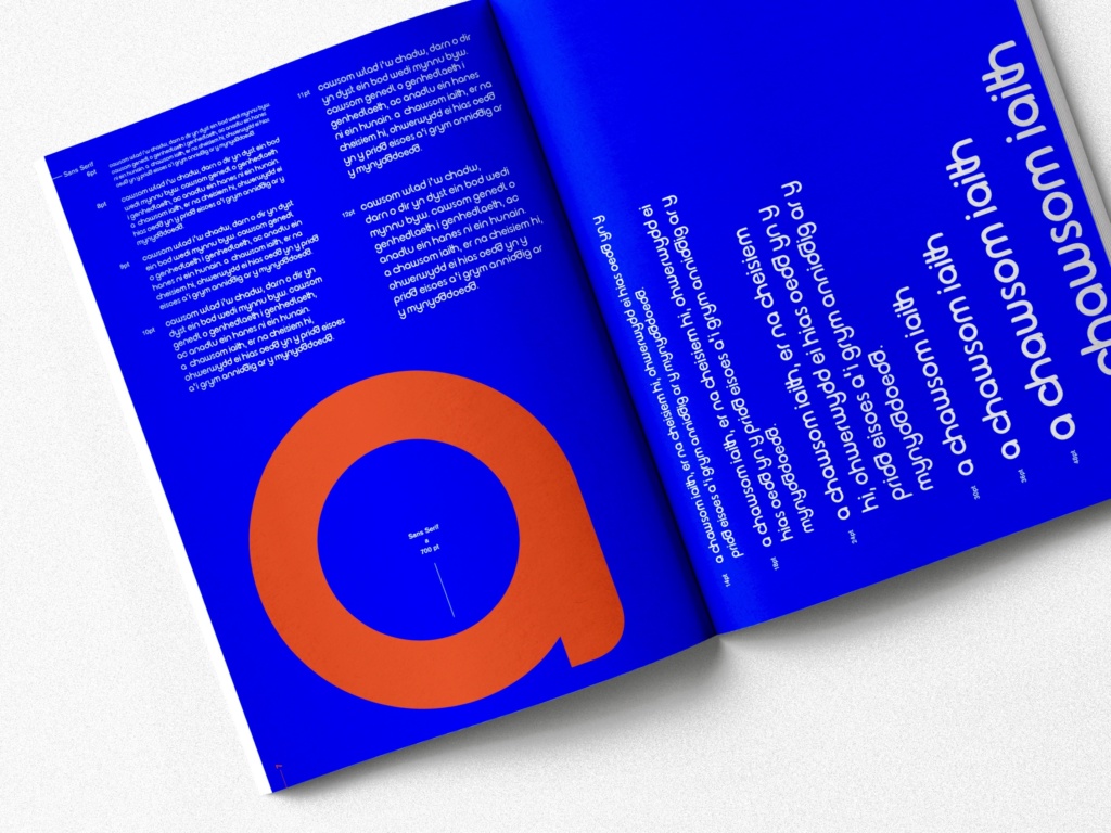
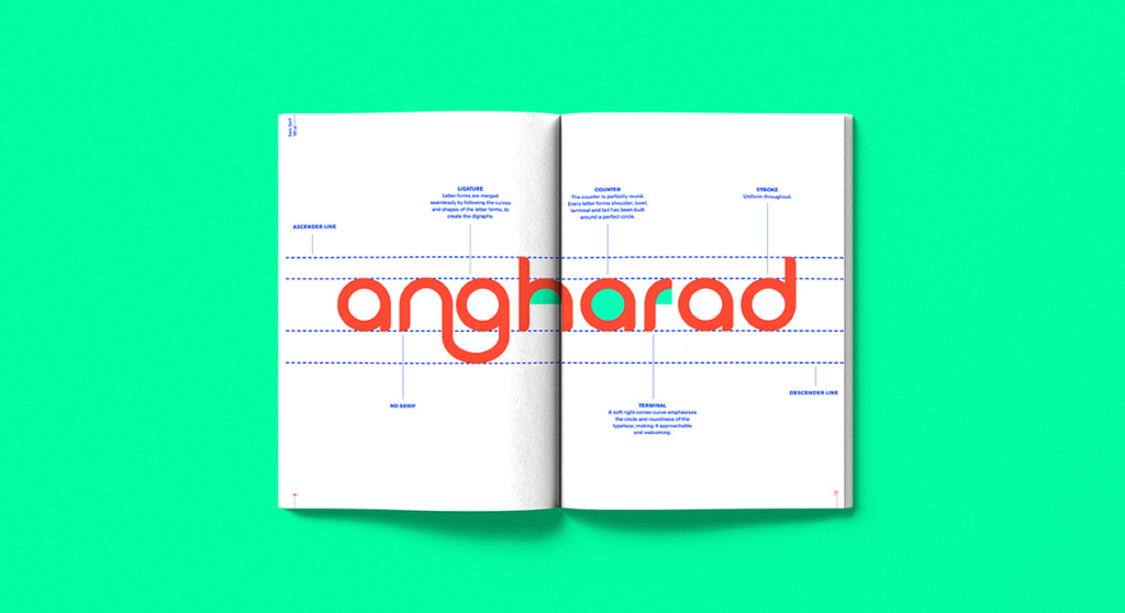
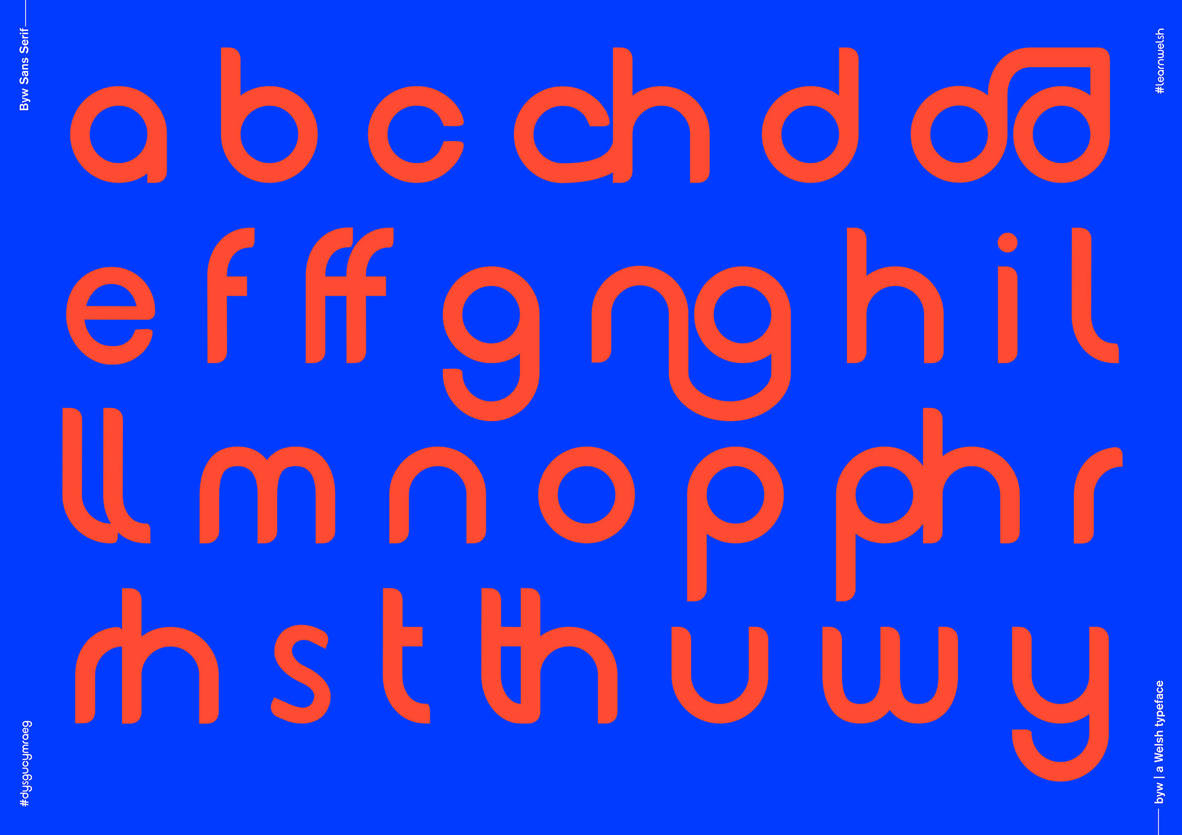
Byw, A Living Typeface
Final Major Project Editorial Design
My final major project aims to encourage learners, and the use of the Welsh language. In 2017, the Welsh Government announced a new vision for a million Welsh speakers by 2050. This body of work aims to help reach this goal, by expanding the Welsh language digital landscape. It also aims to increase exposure, and accessibility to the Welsh Language. By using design to celebrate the uniqueness of the Welsh language, people will be able to understand the importance of keeping the language alive.
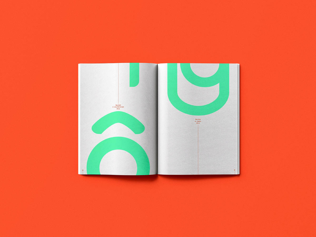
Byw (meaning living) is a family of living Welsh typefaces, designed with this Welsh community in mind. The Welsh alphabet includes 8 digraphs which are special to the Welsh language- Byw has been designed with these letters as ligatures. There are 2 weights within the family; Byw Sans Serif, and Byw Variable. The variable weight has been designed as a phonetic alphabet. The stroke width of each letter depends on the position of the tongue in the mouth when the letter is pronounced. This weight will give learners confidence with the pronunciation of letters through a visual system. The typeface has been applied to outcomes that encourage learners and the use of the language.